


MASAZETATRY.SK
Client: Masazetatry.sk
Timeline: Freelance
Role: UX design, UI design, Content Design, UX Writing, Research
Increasing booking conversion rates by enhancing functional feedback throughout the user journey.
Masážetatry.sk is a unique mobile massage service in Slovakia, owned and operated by licensed physical therapist Matej L. The service offers home-order massages for individuals, couples, or groups—such as ski trips, team-building events, and more.
While the concept is one of a kind in the country, the business faces challenges communicating its location-based pricing and minimum order requirements, making online booking tricky and leading to an over-reliance on customer service.
Throughout the design process, I worked closely with the stakeholder and a UI designer to simplify the booking experience and boost conversions. We focused on making the location input—the anchor of the booking process—more intuitive and ensured clear feedback throughout the process to support independent bookings.
. . .
UNDERSTANDING THE PROBLEM
01 CURRENT BOOKING FLOW
The brand's unique selling point is home delivery, and just like services such as Deliveroo or Uber, customer location impacts pricing, minimum orders, and delivery terms. However, customers currently struggle to understand their unique order conditions – the booking is stretched across 8 screens, the conditions are not clear and the error message does not provide clarity on how to fix a problem.
The lack of clarity makes independent online booking difficult and leads to over reliance on customer service and booking services over the phone.

02 WHERE CAN I INTERJECT IN THE CURRENT FLOW?
To identify where I could interject in the current flow, I mapped out customer decisions. This exercise revealed gaps in the information provided at the start of the booking process, highlighting the opportunities for redesign to better accommodate dynamic pricing.
By visualising the existing customer journey, I was able to pinpoint key moments for improvement. This informed the design of feedback interventions at the beginning of the journey, which simplify and streamline the booking experience.

DEFINING SOLUTION SPACE
Location is key to the business’s dynamic pricing, as it determines each customer’s individual pricing and order conditions. To simplify the booking process, I redesigned the flow to personalize the customer experience.
The new flow places location input at the very start, generating feedback on pricing and conditions, instantly after the input. By showing customers only the pricing details of their own location, the redesign eliminates confusion, reduces complexity, and provides a seamless booking experience.
IDEATION: LOCATION LOCATION LOCATION
To kickstart the redesign, I created initial paper sketches to outline ideas for the main screen, focusing on delivering a comfortable and clear booking experience to improve user conversions. These early visualizations served as a foundation for developing features and presenting options through wireframes and mock-ups, which streamlined collaboration with the stakeholder. This process helped refine how location input and feedback guides users through the booking process.
Goal
Design homepage elements that prompt users to input their location, enabling them to access personalised pricing and conditions seamlessly.


Approach
The redesign focused on two main objectives: 1) highlight the importance of location by prominently featuring a location bar and providing immediate feedback; and 2) use location-focused content, such as rotating images and contextual copy, to communicate the service’s adaptability and relevance, enhancing customer understanding.
To support this, I also crafted clear CTA copy, an intuitive action input bar, and actionable feedback messaging, making it easy for customers to access their personalized order details effortlessly.

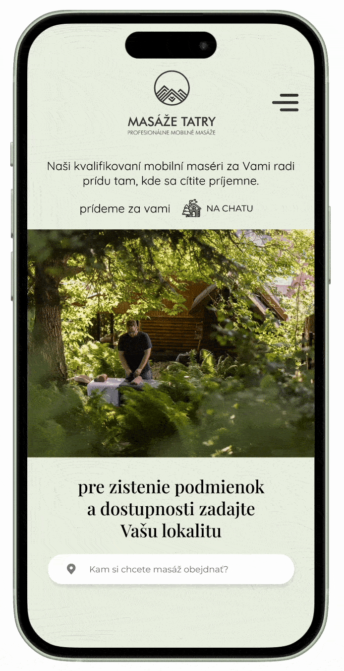
DELIVERY
Compared the current web experience, my solution spotlights the core elements of the service, and streamlines the booking process by creating a more efficient feedback loop, all within the first screen.
Rotating images and copy convey the service's context and adaptability. This improves customer understanding of the service, communicates its geo-specificity and guides them towards the key interaction: location input. Designed Call-to-action (CTA) copy, an input bar, and a feedback message then allow customers easily access their specific order conditions.


Feedback on location pricing
Call to action
Location input

Rotating images and copy to communicate the context of "mobile" therapy
"Our qualified massage therapists will meet you, where you feel most comfortable."
AT HOME
AT A CABIN
ANYWHERE
While the new design does not solve the complexity of the pricing itself, individual feedback funnels the customer towards the information relevant for carrying out a booking flow. Immediate pricing feedback also resolves a dark ux pattern, in which full price and conditions are not revealed until several screens into the booking flow.
. . .
NEXT STEPS
We have handed the work over to developers and are currently in the process of planning phase 2 of this freelance collaboration. Having resolved established a new point of entry into the booking flow, with a more effective feedback system, our next step is re-designing the booking flow itself.